When it came time to create a portfolio, I hit a wall. I wanted something that did more than show my work, it needed to show who I am and how I think about brands. But every platform I tried felt restrictive with stiff templates, limited pages, and paywalls just to unlock basic features. Defeated, I chose a template, started writing copy and then went on holiday. When I came back and opened my portfolio, I hated it. So I used it as an opportunity to upskill and decided to build my site from scratch, despite having only dabbled in code and formal creative software before. Everything had to be learned as I went.

Project Overview
Role:
Creative director
Developer
Period:
2025
Skills:
FE web development
Brand identity
Graphic design
When existing portfolio platforms couldn’t give me the flexibility I needed, I decided to build my own from scratch – teaching myself everything required along the way. I designed an identity, coded a fully responsive website, and created all the visual assets. The result is a custom portfolio that demonstrates not just my work, but how I think about brands and solve problems. Every part of this portfolio is mine, made with love.
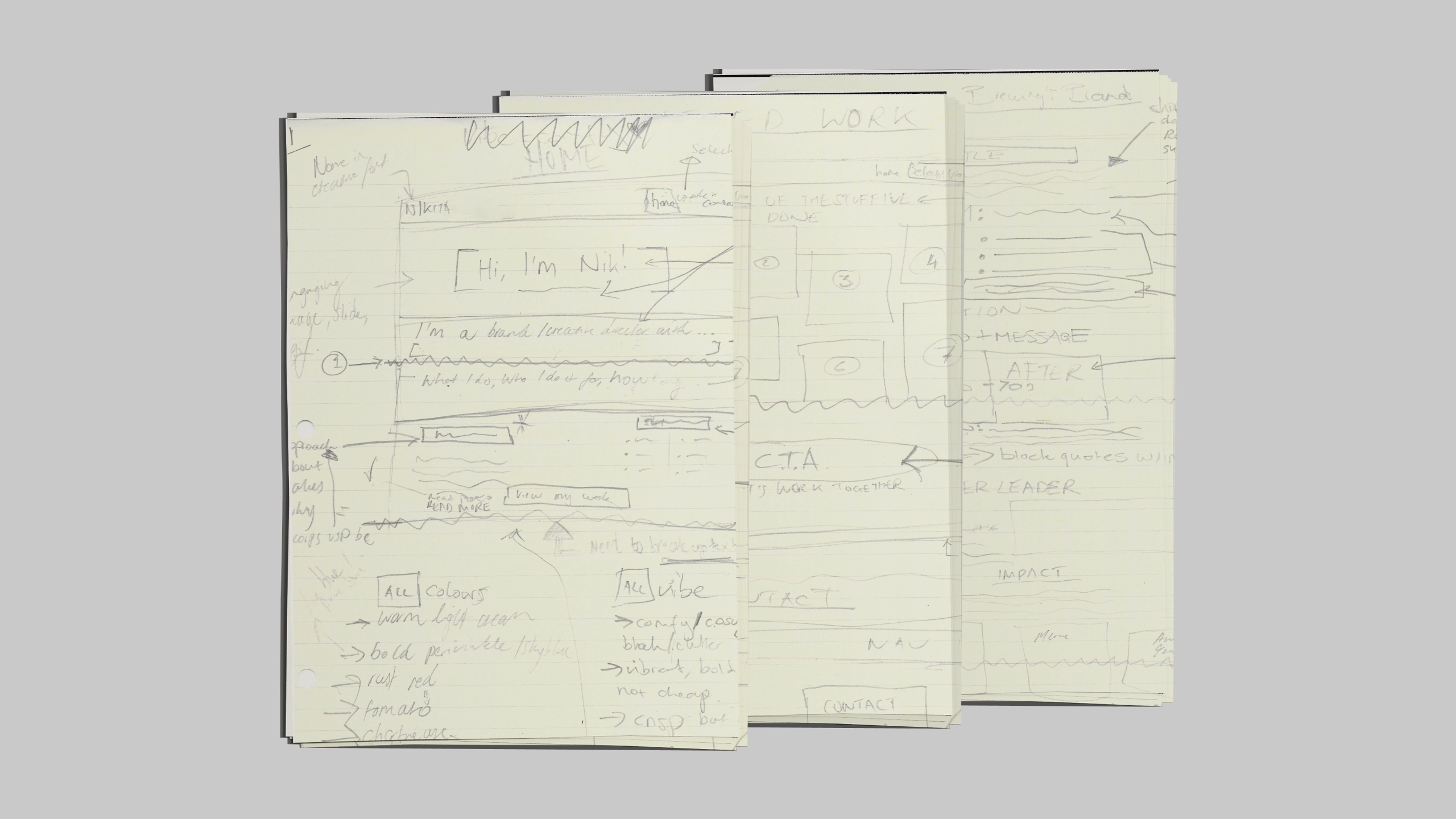
Research I started by looking at portfolios across different creative disciplines to see what worked and what didn't. From there, I drafted a wireframe on paper, mapping out how I wanted the site to look and my key goals based on what I'd seen.
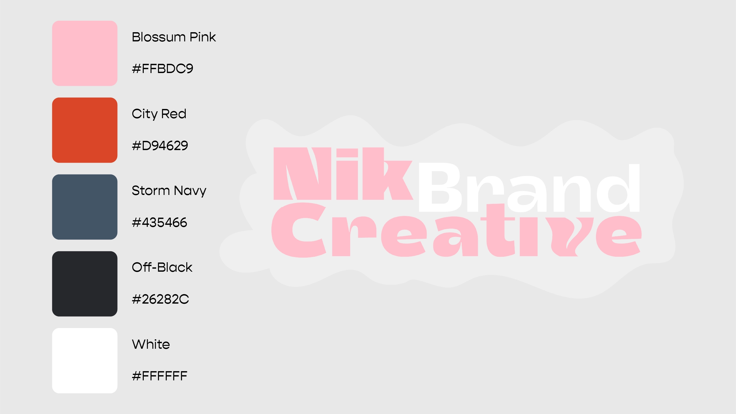
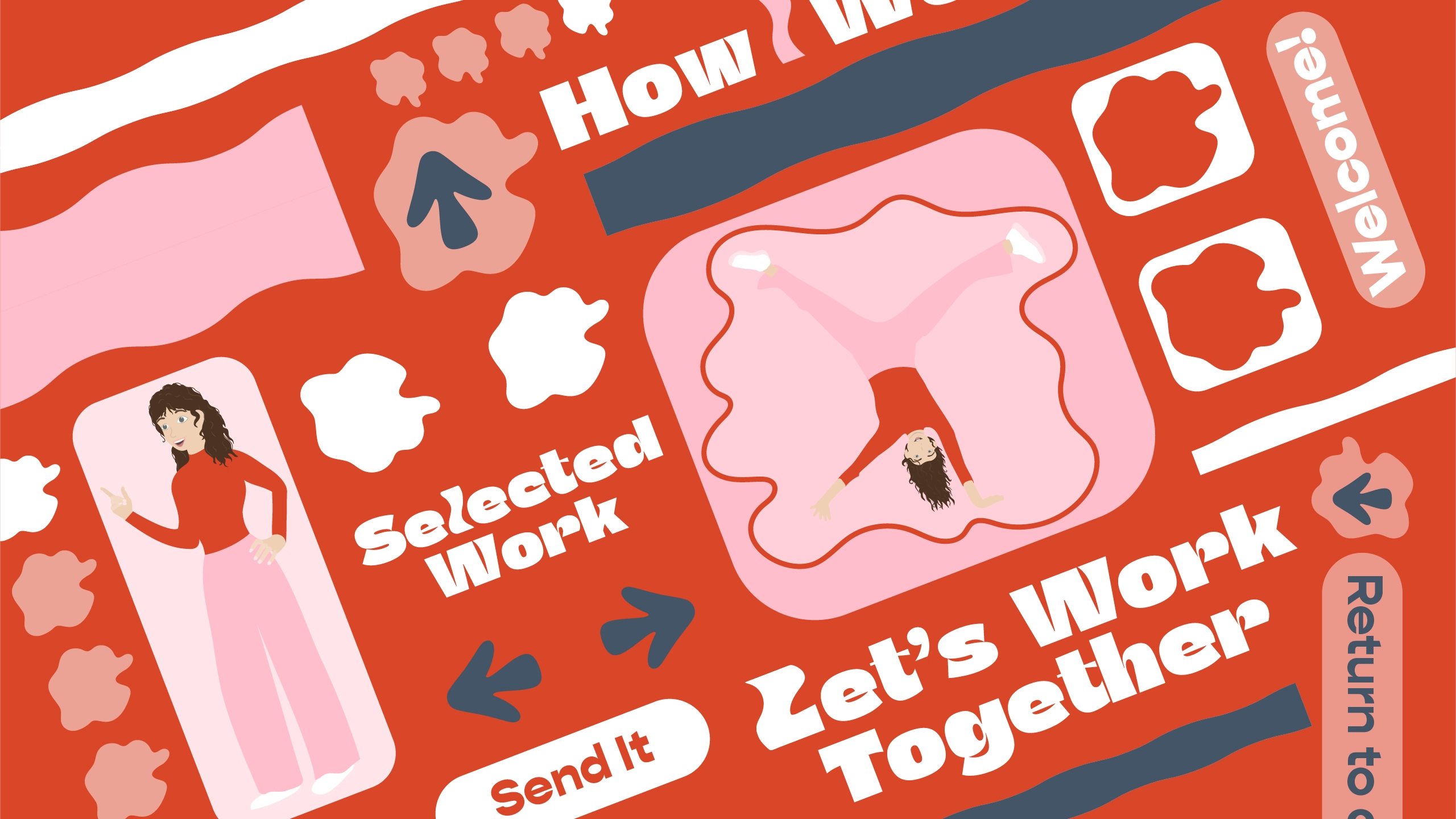
Logo and identity I followed the golden rule and designed in black and white, going through several iterations before landing on a typographical logo using a hand-tweaked version of Total Black Variable. I also developed a colour scheme that I refined as the visual identity came together.
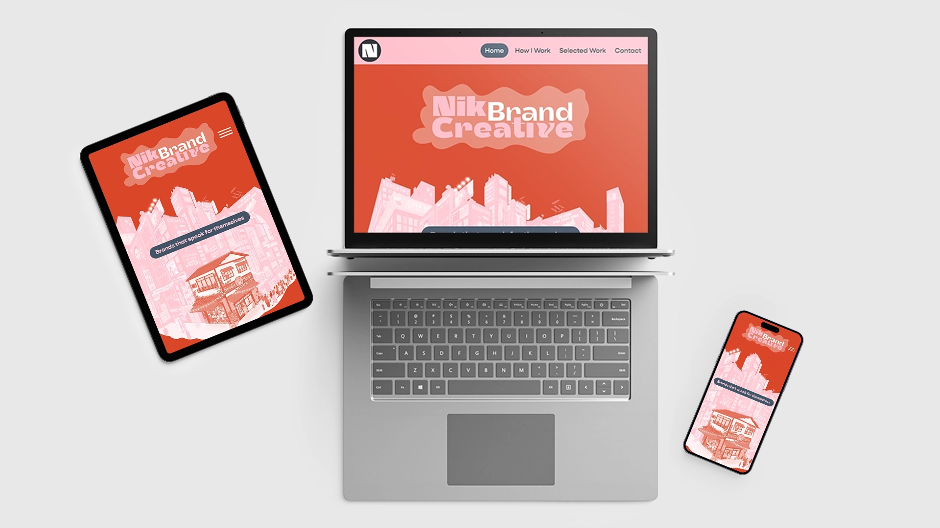
Landing page The concept was "brands that speak for themselves" — a scenescape full of businesses shouting for attention, surrounded by lifeless, transactional advertising. Soulless messages telling customers to buy without any effort to understand them as real people. In the scene, it all blends together and people take no notice. At the centre sits a small restaurant full of character, simply called "Noodle House." It's unassuming, honest about what it offers, and full of customers with a line stretching down the block. I drew the entire scene in Illustrator, teaching myself the tools as I went.
Development I went from drag-and-drop builders to coding an entire site. Learning HTML, CSS, and a bit of JavaScript through research, AI assistance, and resources like the Mozilla Developer Network. I started with a rough layout and refined it relentlessly, researching best practices for web UI/UX and responsive design. I learned about file types, compression, and designing for web performance, making sure the site worked seamlessly across every screen size.
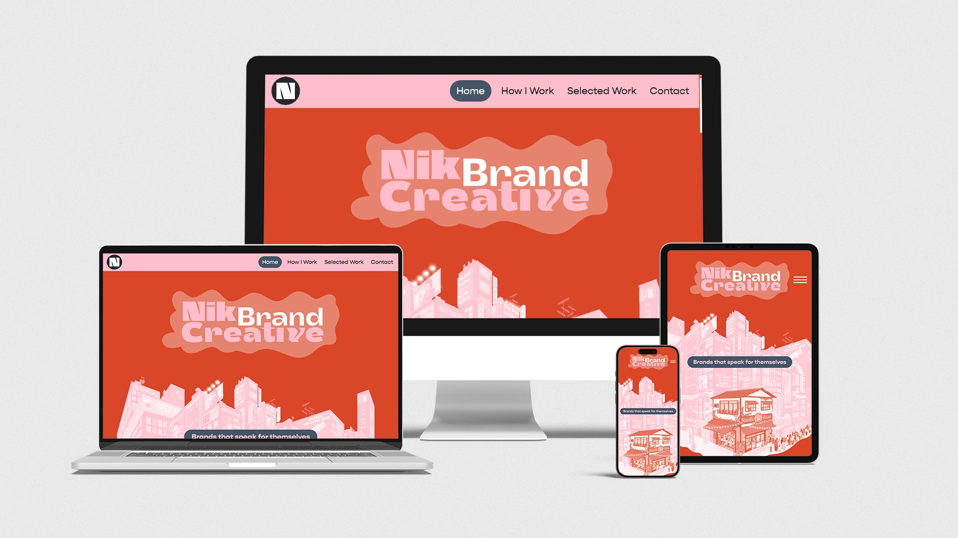
Other elements As I built the site page by page, I created all the visual elements: animations, dividers, custom typography, illustrations and case study before/afters. I wrote all the copy content myself too. Everything was designed to work together as a cohesive experience.
I built a fully responsive, custom-coded website that reflects my creative thinking. It's proof that I can identify what's needed, learn whatever skills are required, and execute from concept to launch.
More importantly, the process gave me skills that make me a stronger brand director. I now better understand the technical side of digital projects and I can speak the same language as developers. I also gained deeper hands-on experience with graphic and video tools, which means I can contribute directly to the creative process rather than just directing it.